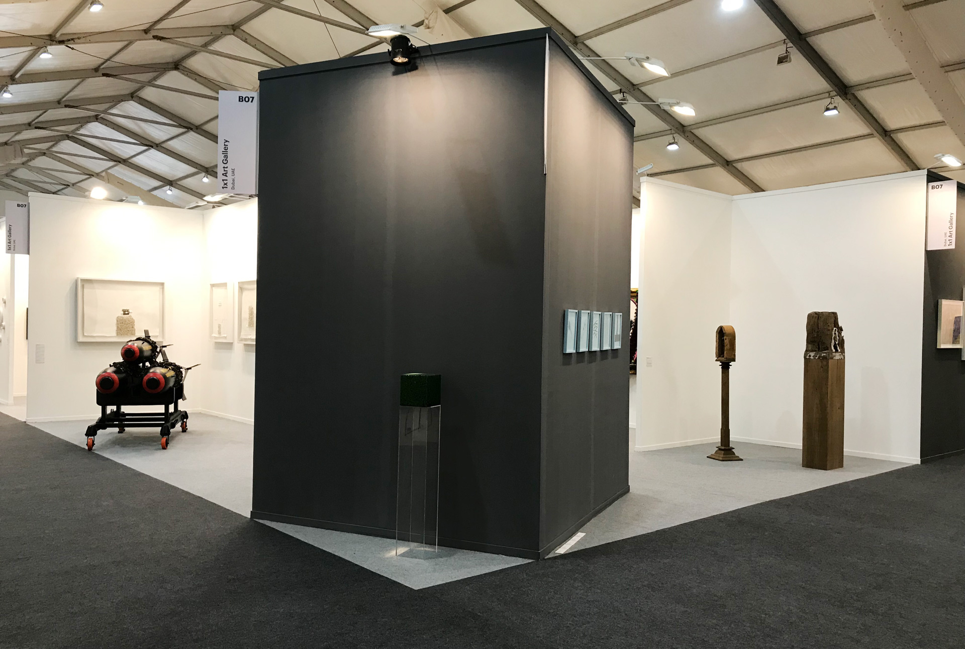
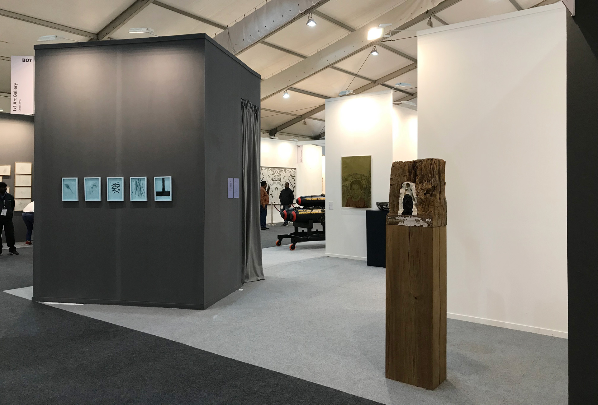
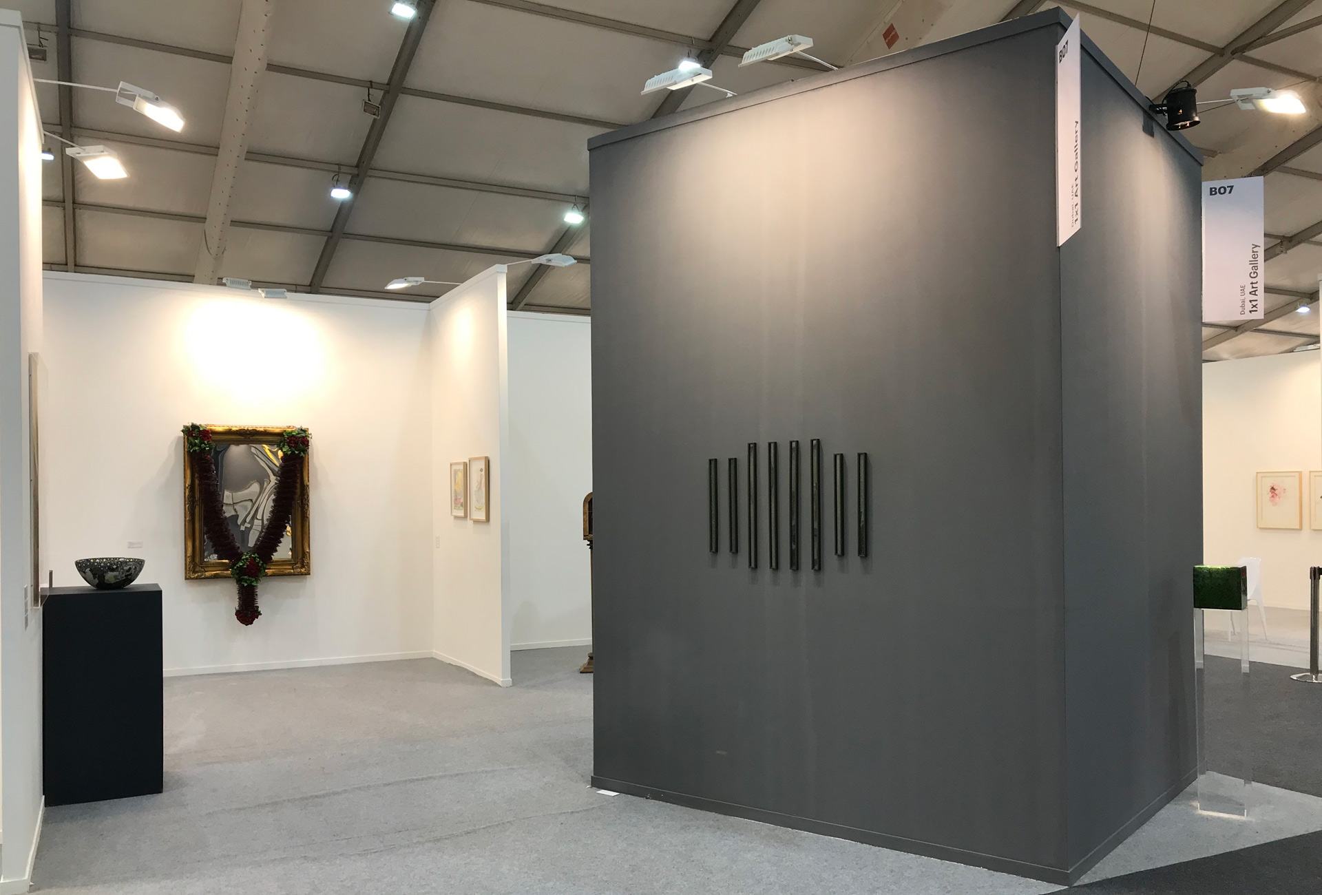
1X1 @ IAF 2019
BARI KUMAR
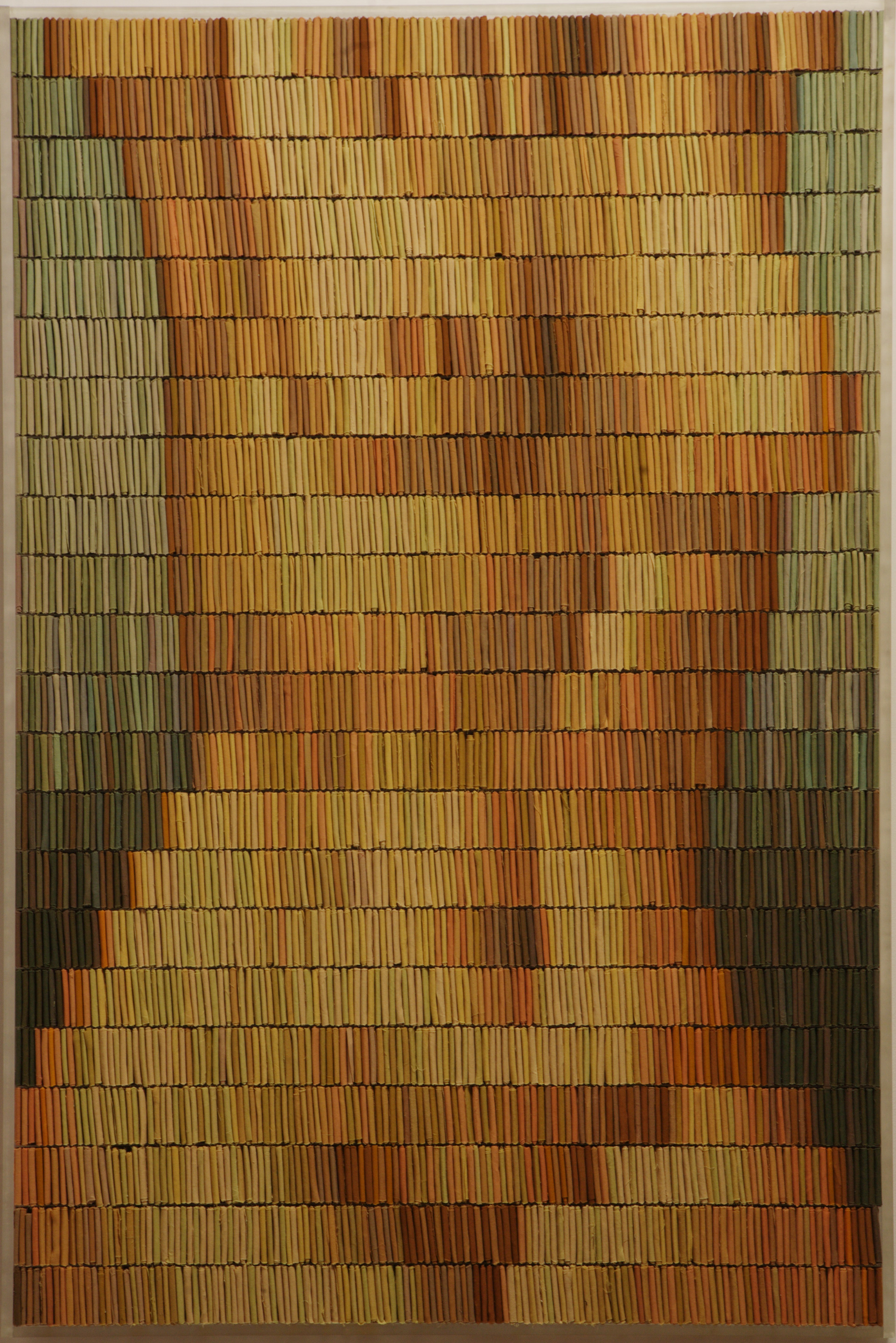
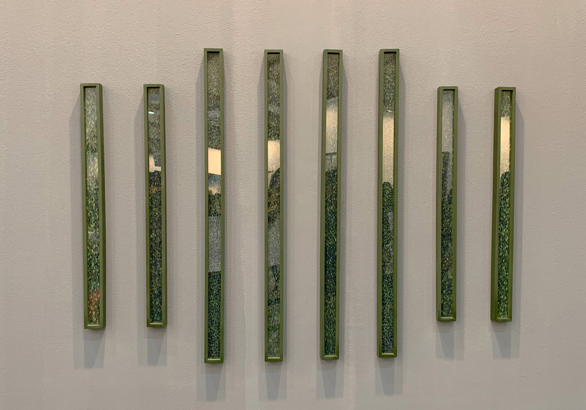
Bari Kumar has been drawn to the vibrant hues of the stacks of materials displayed in saree matching centres. Stores from where one can purchase the sari fall material, used to create the inner lining at the bottom of a sari. It gives the cloth its structure and compliments it from within while remaining unseen. And it is this juxtaposition of the seen and the unseen, combined with the complexity of the range of vibrant colours to which he seeks to pay homage.
Bari’s installation recreates the folded bolsters of this material on a miniature scale, stocking them like books on a shelf to create mesmerizing images of a body denuded, with the chromatic scale putting the spotlight on brilliant range of colours that otherwise go unnoticed. By choosing to use the cloth to represent the body, he creates an interesting and thought-provoking dynamic wherein form exists only while the cloth remains.
Born in Andhra Pradesh in 1966, Bari Kumar studied at the Rishi Valley School founded by philosopher J. Krishnamurti. In his teens, he moved to L.A. to study graphic design at Otis/Parsons Scool of Design, graduating in 1988. Like numerous Asian artists living in the United States, Bari Kumar`s work is a reflection of his bicultural experiences.
CHITTROVANU MAZUMDAR
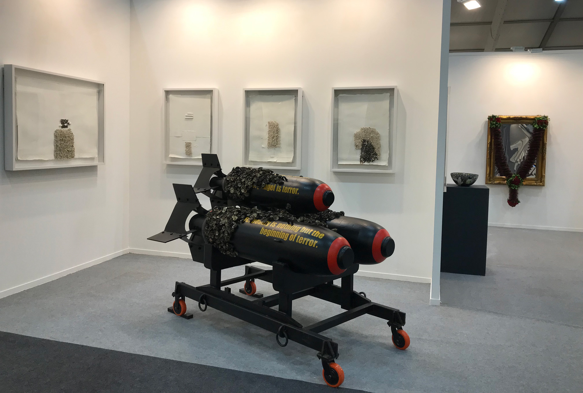
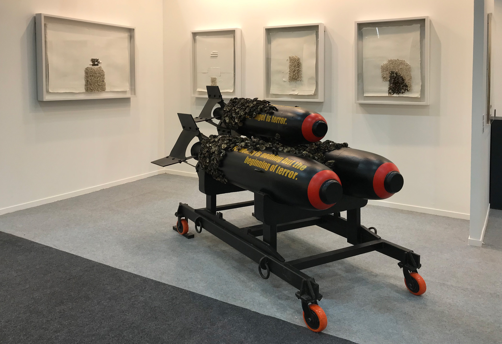
The sublime is a cusp, a moment, where beauty begins its fall into terror. It is the approach to the ledge, the anticipation and the sheer expanse that awaits – the realization that what is beheld (what is desired) is unfathomable, even terrible. It is a loss of control where the boundaries of the self and other begin to crumble. Chittrovanu Mazumdar explores these ideas in a series of new works for the India Art Fair 2019.
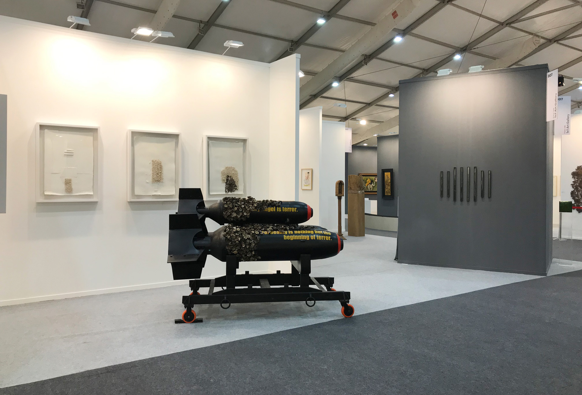
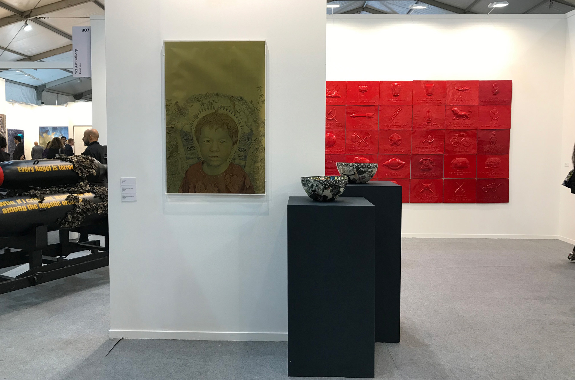
Drawing upon text from Rainer Maria Rilke’s Duino Elegies, Mazumdar poses existential questions about life, death and what comes afterwards. Words run along Mazumdar’s untitled sculpture, a series of missiles. Rilke’s text is incorporated in a stark primary yellow, and red lines circle the warhead.
Here the past holds up a mirror to the present - the warheads not only harken back to the horrors which preoccupied Rilke but probe the current register of political aggression.
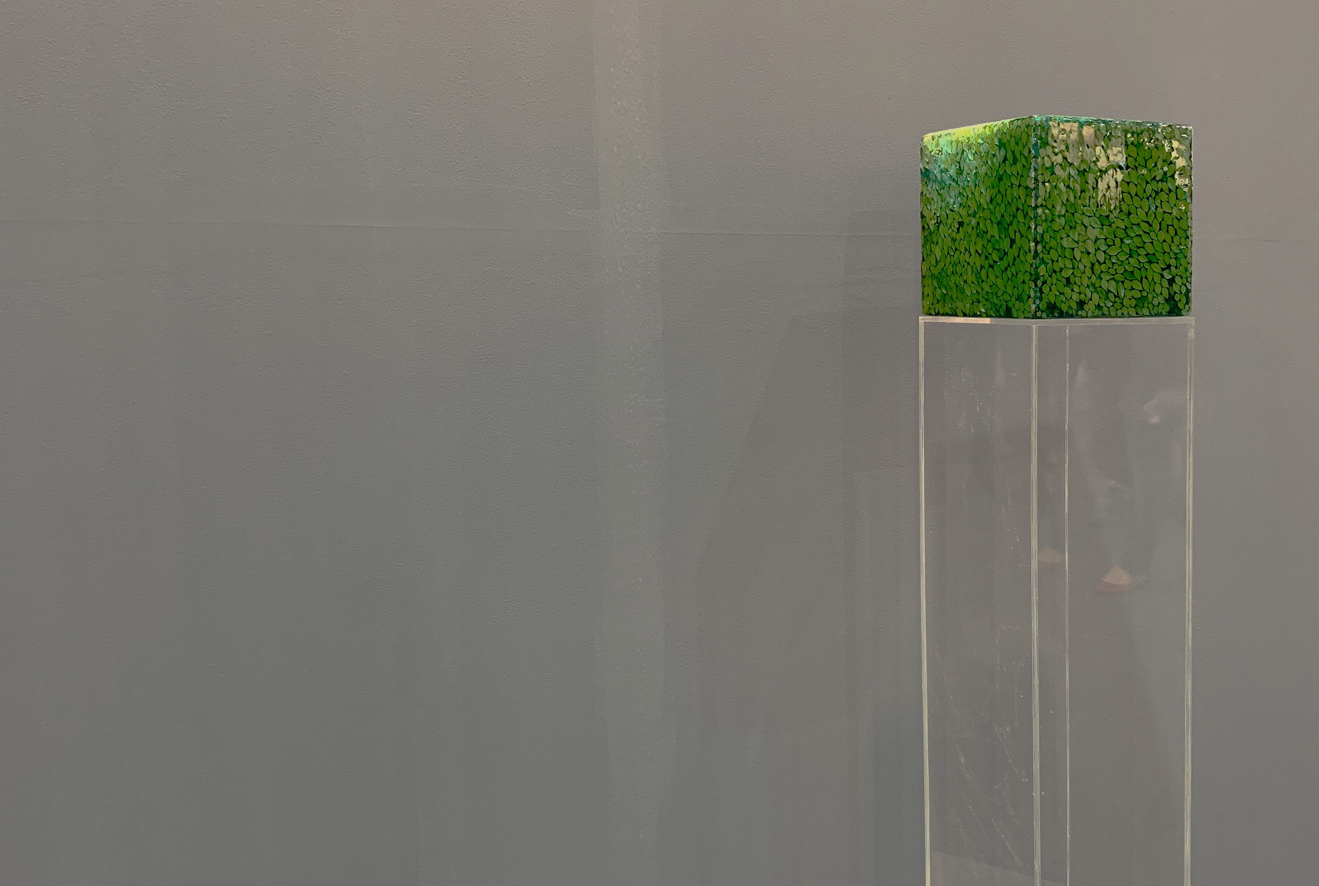
Small ceramic flowers grow amid the text in contrast to the sleek surface quality of the missiles. These flowers are hand-formed, individually smoked and seem to mushroom from within, creating a tension between hard and soft, natural and man-made. Like a covering of moss or fungi, the flowers indicate a process of decay and the slow resumption of life after death and destruction. How do we make sense of indiscriminate violence? How are histories unearthed, and how do they repeat themselves?
The ceramic flowers are revisited in a series of paper works where Mazumdar investigates their bare fragility. Between the delicate petals, glimpses of Rilke’s verse can be found again, like a forgotten newspaper headline, now moldered beneath the overgrowth.
- Avni Doshi
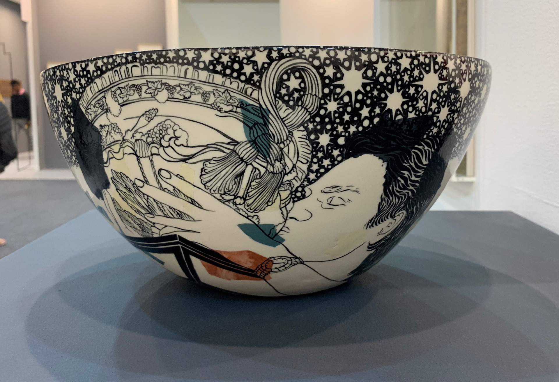
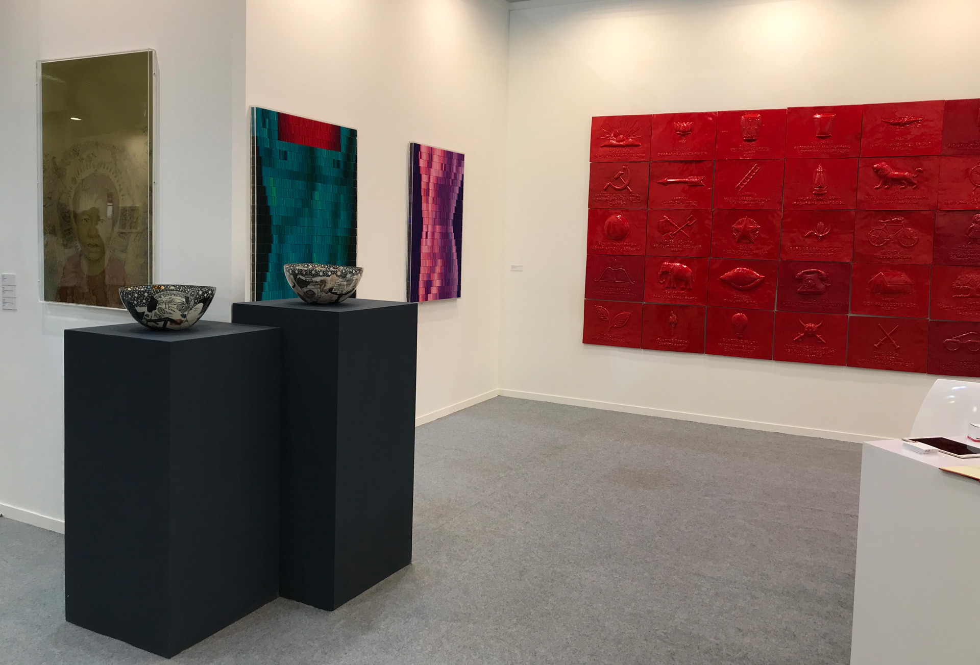
FAIZA BUTT
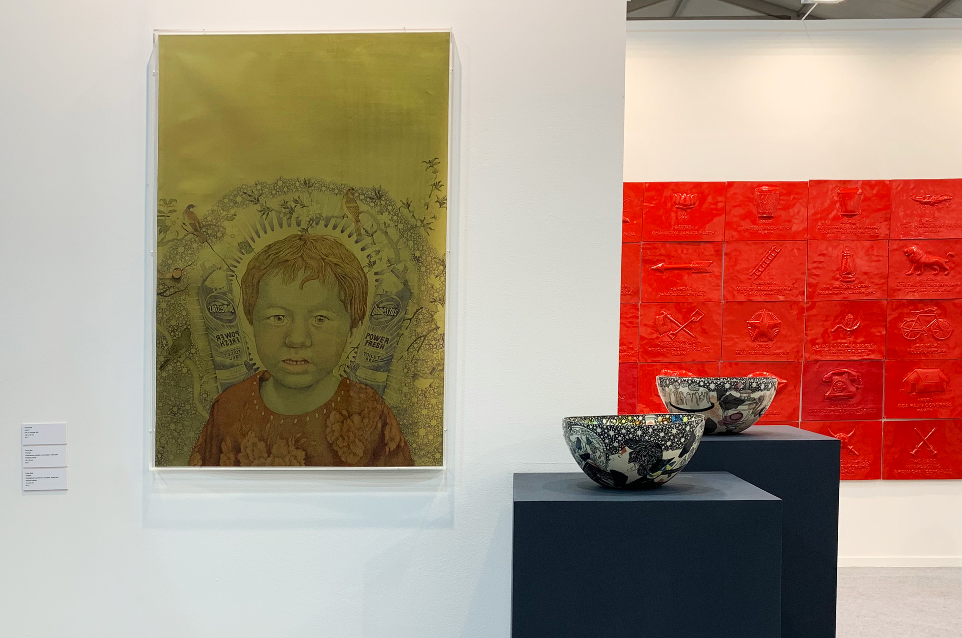
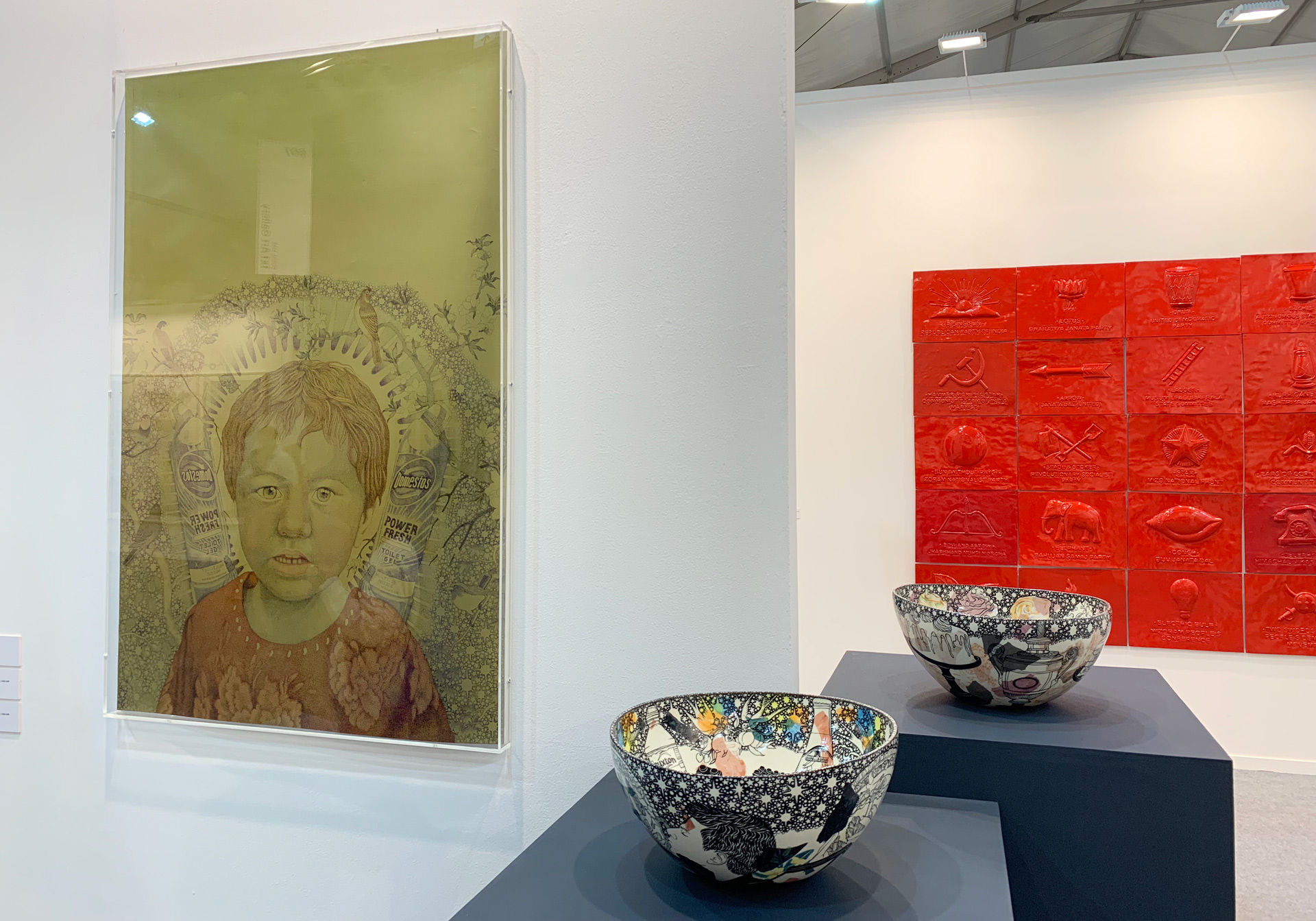
Born in 1973, Faiza Butt trained at the NCA in Lahore and the Slade School of Art in London, with her work being shown at various museums and included in several publications. Her work, steeped with meaning and significance, utilizes an elaborate and intricate drawing process, obsessively crafted with passion and rigour, to produce surfaces that hover somewhere between a photograph and embroidery. Although a trained Slade artist and living in London, Butt's Pakistani roots are clearly evident in her work as she brings to our attention various social, gender and political issues faced by a young Pakistani.
Faiza’s ceramic bowl installations question gender and how its ideals are promoted, with each peace demanding a deeper examination to unveil the layer of tragedy amongst the comfort. These depictions range from a Disney princess kissing a bird in her utmost representation of femininity while surrounded by branded goods that represent Western affluence and the good life, to a set of sports shoes set against a platter of scallops that creates visual tension and evokes a response. The running theme of layering the desirable with the undesirable continues though her work with ceramics, with each reflecting gender, the human condition and conflicts of territory. Each of these porcelain pieces are handmade, inlaid with marbled Terrazzo pieces and then painted with underglazes.
At the same time, her series of paperworks discuss the human face as a landscape of psychological inquiry, utilizing the juxtaposition of contrasting imagery yet again through images of refugee children drawn in ornate detail set against varied objects such as bottles of bleach and commercial objects as a commentary on the world and it's duality. Each of these is painstakingly crafted, using a near obsessive technique of tiny dots using Indian ink pens that she developed by mixing the ‘Purdhkat’ rendering method of Indo-Persian miniatures with pixels of a photograph. The drawing is developed on polyester film coated with specially mixed gold pigment emulsion.
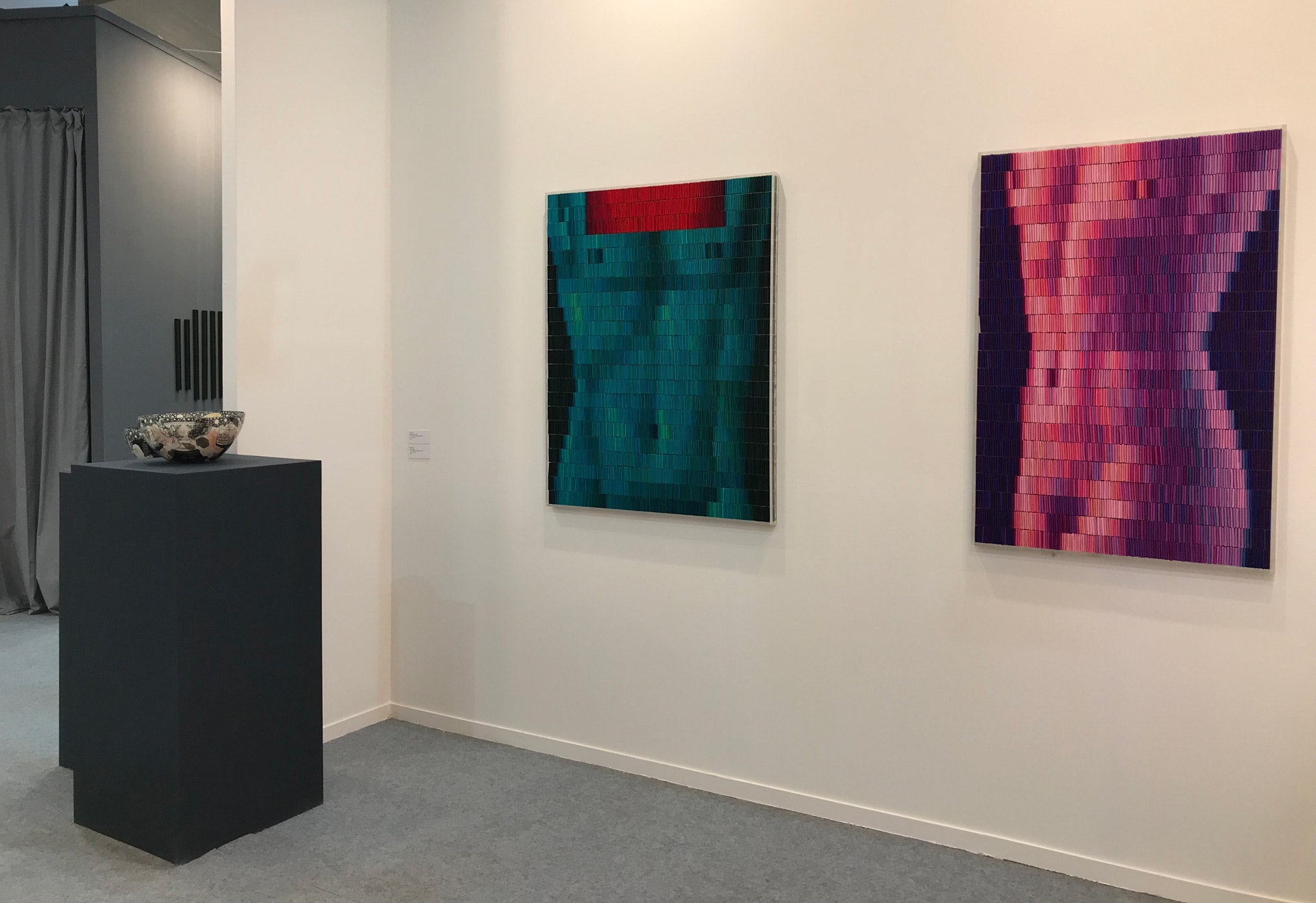
POONAM JAIN
From a young age, Poonam Jain has been fascinated by pedagogy and architecture, both as spaces that we occupy during our existence as well as the surroundings we create for ourselves in which we dwell. Within her work, Poonam constantly merges language, numbers and the equations formed in between, making the observer question the lens through which they view the world, giving them a peek into the micro-narrative formed by the language of numbers. There is a hint of dystopian worldview that can seem negative at first but as you explore each piece, you realise that within the dystopia lies the path to opportunity. Whether you take it or not that's up to you.
In continuation of her pursuit to reach infinity, Poonam’s work features a juxtaposition of numbers written in words, bringing to fore two specific experiences from the observer’s life - the first being learning numbers by writing them in words at school and the other being numbers written as words on cheques, invoices or currency notes.
In Dropouts, she has plucked colours out from their rigid existence in four-lined school note books, freeing them from their single-minded role and using them to put the observer in a state where they feel they are ready to learn again.
At the same time, in 'ab sapne mat dikhao’ or ‘don’t show me more dreams’, the colour black has been used to give the collection the memories of deteriorating structures. Together with red and blue, the combination of colours creates an immersive experience that questions and explores the status quo.
RINA BANERJEE
In her practice Rina Banerjee challenges current nativist political leanings by proposing a multi-faceted nature of identity; not based exclusively on a person’s culture of origin or gender, but instead on self-identity. These inclusive and freeing conceptions of the “self” manifest themselves throughout Banerjee’s ever-evolving work – in fragmented figures, riotous use of color, and symbolic materials. Paired with her thought-provoking and poetic titles, Banerjee’s works relentlessly query contemporary modes of artistic production and societal engagement.
Banerjee was born in1963 in a Bengali family in Calcutta (now Kolkata) in the Indian state of West Bengal. She grew up in London and New York City, and has lived in the United States ever since. Banerjee has mentioned in interviews that the inspiration for her art comes from her childhood memories of visiting her grandfather during his homeopathic treatments. Many of the images and visuals from her visits with her grandfather have stayed with her and can be seen in her art work. She completed an M.F.A. in Painting and Printmaking from Yale School of Art, Yale University in 1995, after graduating from Case Western Reserve University, Ohio with a B.S. in Polymer Engineering. Banerjee's work has been exhibited at the Bronx Museum of the Arts, the Whitney Museum of American Art, and other notable museums.
Make Me a Summary of the World the first in-depth exploration of her contemporary practice, co-organized by the Pennsylvania Academy of the Fine Arts (PAFA) and the San José Museum of Art (SJMA) is currently ongoing at the PAFA.
SUNIL GAWDE
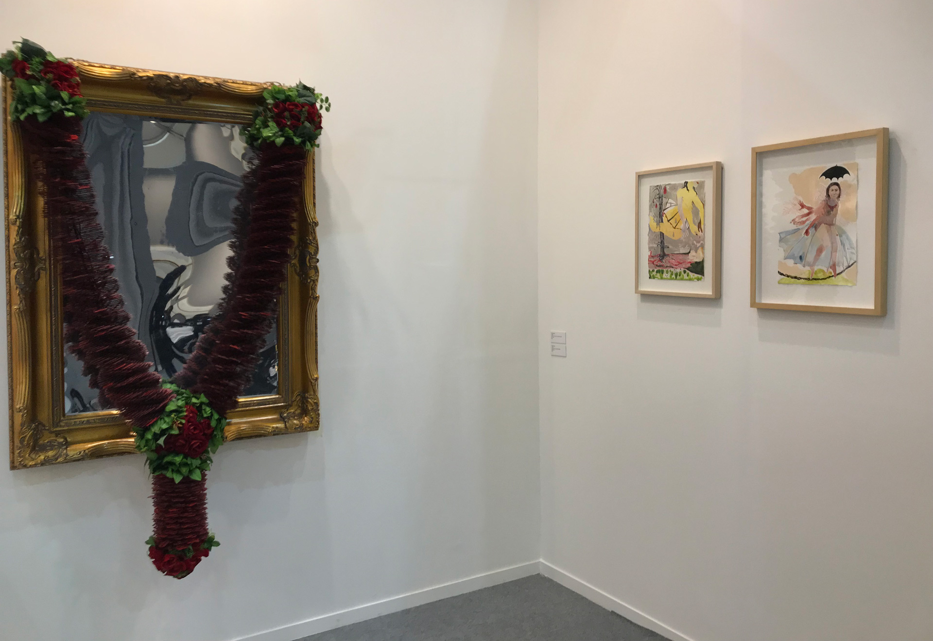
The garland dangles in its comforting nonchalance, reassuring in its familiarity. Approached closer it startles with its sheer incongruity. What appeared to be a conventional juxtaposition of roses and petals turns out to be powder coated razor blades! The blades hang in methodical, controlled repetitive patterns of beauty, interspersed with decorative roses; there is a mesmerizing rhythm, an architectural constructional choice made for the aesthetic imperative.
There is something very perturbing in this use of razor blades as flowers. The garland always has a quasi-sanctifying role. The act of shaving, however, has usually been looked upon as deeply ritually polluting, requiring immediate ablutions. To juxtapose such an uncomfortable object with a symbol of the apex of ritual purity is splendidly subversive. The pollution/ purity dichotomy is never stated; it is just felt intuitively as an uncomfortable heave from within the bone marrow.
The garland is hung on a mirror, which has an elaborate gold gilded frame, evoking the feeling of reverence. The mirror is expected to record one’s reflection with all its perfection and blemishes but this one distorts your images in many fragments, impossible to find a clear reflection. When confronted with this disturbing imagery, one tries very hard to find what one thinks is the actual image of that person. So does the mirror deceive you or is it making a confrontation?
- Sunil Gawde
Born in Mumbai in 1960, Gawde graduated in Fine Art from the J.J. School of Art in 1980. In 1995, he received the British Council’s Charles Wallace Award for 1995 -96, and spent a year as a visiting artist at the Glasgow School of Art, Scotland. Since 1990, Gawde has held more than 11 solo exhibitions worldwide and, in 2009, he was invited to participate in the 53 Venice Biennale, curated by Daniel Birnbaum. His works were show in Centre Pompidou, MOCA Taipei, Kunst Museum Bocham among others. His work has been collected by the National Gallery of Modern Art, the Kiran Nadar Museum of Art, and the Devi Art Foundation in India, as well as by important international private collections.
WARDHA SHABBIR
Based on the “Nuqta” or “Dot”, Wardha Shabbir’s laborious rendering of countless dots come together as a unit to form an idea on the surface, symbolizing infinity and life. Akin to miniature paintings done for manuscript illustration, she has thoughtfully picked organic symbols of earth, water and sky to paint contemporary utopian pathways, or Siraat, signifying a course of clarity amidst the clutter of contemporary values and states of being.
In this installation, various mediums come together as one to explore a perspective of power and utility of human imagination through visuals showing constant dialectical opposition between social conventions and human freedom. As always, Wardha Shabbir strives to immerse the observer into her work through a surface that connects the physical to the realms of the mind, inserting them into a reality created through reference points of the imagery used, initiating a thought-provoking process of demystification.
Shabbir lives and works in the city of Lahore, Pakistan where she graduated from National College Of Arts with an honours in 2011, followed by the prestigious Principal Honour Award. .Wardha has been awarded with many scholarships, grants and was also selected for an exchange programme in Paris,2010 with (ECOLE) during her Academic years (2007-11). She has been awarded the best young artist Award from AL-Hamra (2011). Since her graduation Wardha has been exhibiting widely on both National and International levels. She has been the visiting faculty of National College Of Arts (NCA) since (2012).She is currently running an open studio for students. She was the first artist from Pakistan selected for Flacc, Belgium where she initiated a research based experiment on human Sensorium while transforming a 2D miniature paintings into a 3D Interactive Environment.
VIVEK VILASINI
In his work Vivek Vilasini examines our existing social structures, adapting various expressions of cultural identity prevalent in society today to raise questions about the continually changing global scenario that every individual struggles to keep pace with. Vilasini has critiqued official and tyrannical ideologies with images of sarcasm and everyday pun.
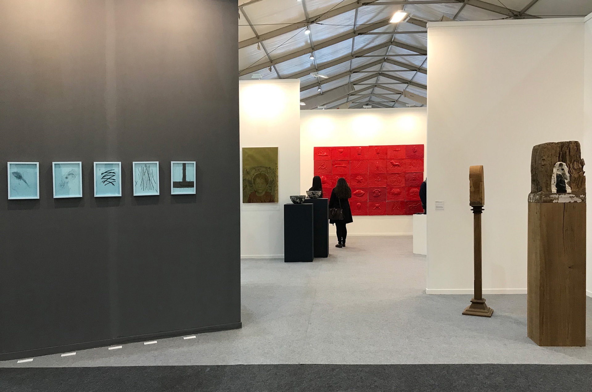
Between One Shore and Several Others (Election Symbols) is a collection of political party symbols from India. These very ordinary recognizable images are the representations of the collective aspirations, ambitions and ideologies of the political parties. It is the primary mark of the party and their identity. When seen collectively, on a monochromatic surface, these symbols resonate a kind of absurdity beyond everyday party-political tales.
Vivek Vilasini (b. 1964, India) trained as a Marine Radio Officer and pursued Political Science before turning to art and studying sculptural practices under traditional Indian craftsmen. His concept based works have been shown at various prominent institutions including Newark Museum, New Jersey; New York University Museum Gallery, Abu Dhabi; MoCA Shanghai; and Centre for Contemporary Art Barcelona. Vilasini’s works are in the collection of Kadist, Toronto Museum and Singapore Art Museum, amongst others.